Designing a digital wallet for Swish & everyone in Sweden
Designing a digital wallet for Swish & everyone in Sweden
Designing a digital wallet for Swish & everyone in Sweden

Client
Getswish
Agency
Bontouch AB
Released
Late 2024
Role
UX Design
Background
We designed, built and shipped a digital payment card wallet inside the Swish app.
It offers supporting banks an alternative digital wallet platform to Google, Samsung and Apple Pay. And provides end users with an intuitive, easy to use and accessible wallet, allowing them to leave their physical wallets at home.
Most of the project details are confidential.
My Role & Team
I drove the design forward from start of the project to the feature being shipped. My role, specifically as UX designer was to uncover user needs and ensure users had a voice during product discussions and throughout decision making for this feature.
Day to day, I worked closely with a senior UI designer. She and I worked in an agile product development team, collaborating daily with; developers, product leads, QA and Swish’s stakeholders.
The shipped feature
Here's a quick walkthrough of the solution, before looking at the design process.
You can try this out for yourself you have a Sparbanken Syd account connected to Swish.
The shipped feature
Here's a quick walkthrough of the solution, before looking at the design process.
You can try this out for yourself you have a Sparbanken Syd account connected to Swish.
The shipped feature
Here's a quick walkthrough of the solution, before looking at the design process.
You can try this out for yourself you have a Sparbanken Syd account connected to Swish.
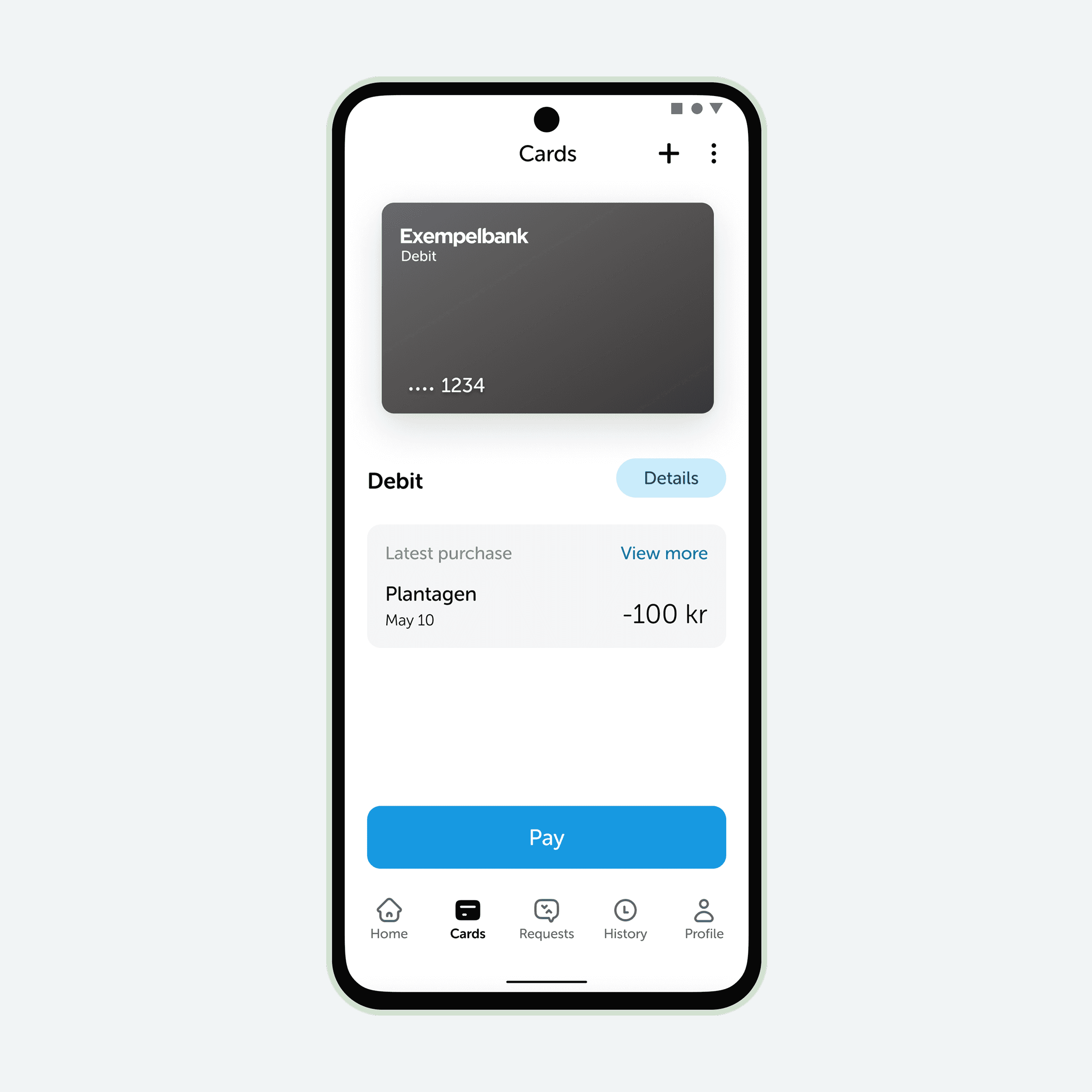
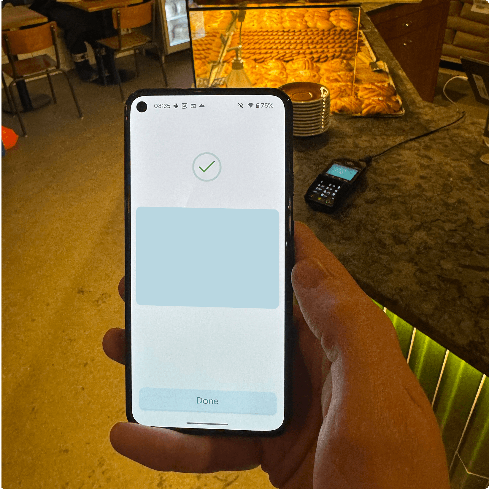
A wallet for card and Swish payments
From the new Cards tab in Swish, you can initiate a payment with your cards, view payment history or double check the card number if you want to get a refund.
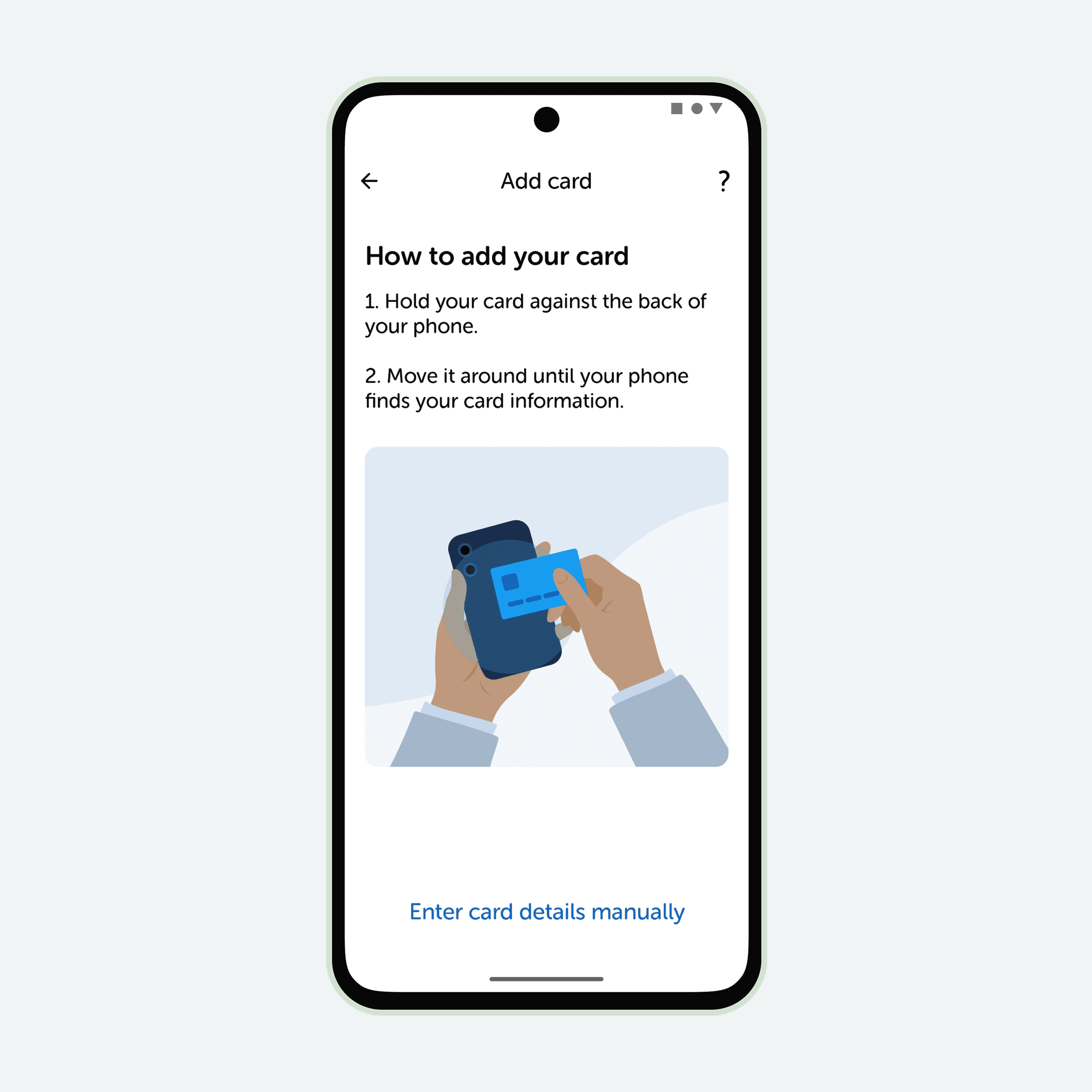
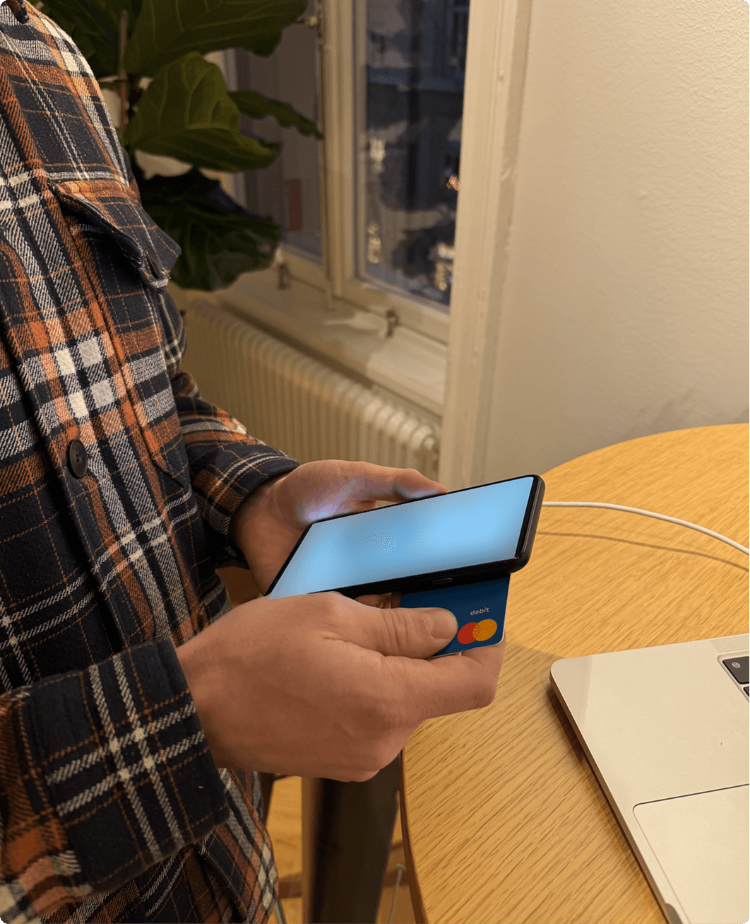
Start by blipping your card
Providing you're on Android and your bank supports this feature, you can get started and add your payment card by scanning it's details with your phone's NFC chip.
After you'll be asked to accept T&Cs, verify with an SMS OTP. Once completed, you're ready to use it to pay.
Three ways to pay
We designed and built this wallet to be useful in all situations.
We noticed many people like to prepare their payment method before getting to a cashier and so you can initiate a payment by tapping pay for your selected card.
Blip your phone to initiate
If you don't have time to find and prepare the Swish app to pay, you can just wake your device and blip the payment terminal to get started.
No need to your phone first, everything happens on the lock screen.
Ready for public transport
You can hop onto public transport by waking then blipping your phone.
No need to authenticate the payment. Just blip and go.
Design approach
We started by conducting research, once insights & design challenges were highlighted, we approached UX & UI design in cycles of experimentation. We constantly invited the wider team to share design feedback, in turn greatly improving our collaboration together, using our minds together to co-own problems and solutions.
As this feature is very much based on how technical elements work, inviting tech feedback early and often helped us together create a product with a better UX than if we hadn't.
Each cycle strengthening the fidelity of the design, moving from whiteboard sketches, to Figma wireframes, prototypes and UI screens & docs to hand off to developers.


User, competitive & market research
This project started as many projects do; the team gets a brief, analyse it together and a tonne of questions come up.
Design got the green light to jump into research, we started with user interviews, end user questionnaires, competitive analysis and market research. Not to mention user testing pre-study prototypes.
Not only did this help us dive into a new domain, it helped us uncover numerous relevant design, product and user insights and a number of key challenges.

Making research insights actionable - defining key design challenges
I visualised scenarios we saw our users actually use this feature with storyboards descriptions, based on research insights.
These sparked two key design challenges:
Where should payment cards live in the app?
How should people be able to make payments?
Here, we also investigated how different requirements might impact the design.


Breaking down the tasks
We used our research learnings to breakdown the components we needed to design to create a viable product for the market in a brainstorm workshop.
This allowed us to separate different flows and parts of this feature into more manageable chunks.
Breaking down the tasks
We used our research learnings to breakdown the components we needed to design to create a viable product for the market in a brainstorm workshop.
This allowed us to separate different flows and parts of this feature into more manageable chunks.
Breaking down the tasks
We used our research learnings to breakdown the components we needed to design to create a viable product for the market in a brainstorm workshop.
This allowed us to separate different flows and parts of this feature into more manageable chunks.

Starting with information architecture - Finding the home for payment cards in Swish
Though I, my design partner and product lead had a few early ideas, we opted to first gather more ideas, to turn over more stones and make sure we weren't overlooking ideas.
We held a design co-creation ideation workshop to generate ideas on where this feature could live inside the Swish app.
The resulting workshop sketches, questions and discussions highlighted four potential paths.

Designing a payment flow that works on every Android device and for every person
Hand in hand to where this feature lives in the app is the ability to for users to make card payments in-store.
We saw two key paths users could take to make card payments with the Swish app.
We explored design through iterations of tappable Figma prototypes. Starting in a rough wireframe stage, built using the existing design system, aided by user testing and refinments. As our confidence of the direction forward increased so did the fideltiy.


Integrating user feedback
We started user testing as soon as we had a tappable Figma prototype for the main navigation and payment flow.
As soon as a piece of the feature came together in a prototype, we tested it. Our aim was to be confident with the design before developers started coding and building that piece of the feature.
(Throughout this project, we met with over 55 participants in person and online to test prototypes of different parts of this feature, all at different stages of design and development process).
Designing the full feature & every edge case
In this case study, I've highlighted two key areas we designed. But of course there was much more too this project.
Designed but not written about are plenty more flows and screens from adding a card to error edge cases. Not to mention plenty of time spent to ensure this feature meets WCAG requirements.

Support for release
Support for release meant signing up for new banks to support the developers and QA with plenty of testing in production, discovering bugs and reporting them in JIRA.
I initiated a backlog for design improvements and sketched ideas for a future roadmap.
I prepared a follow-up on release action plan, planning how we could utilise analytics, bank and user feedback to learn what's working well and what can be improved for the user experience.