Improving understanding & ease of paying credit card invoices for SEB Kort customers
SEB Kort / at Bontouch (now Framna) / Shipped late 2022
Introduction

About SEB Kort
Owned by the SEB Group, SEB Kort is the leading card company in the Nordics - supporting consumers and businesses manage card payments through co-branded credit cards & four mobile apps serving customers as key touchpoints.
My Role
I drove the UX design forward. Pushed for close collaboration with SEB Kort's in-house design lead & their Chief Product Owner for digital channels.
What is this & who's this for?
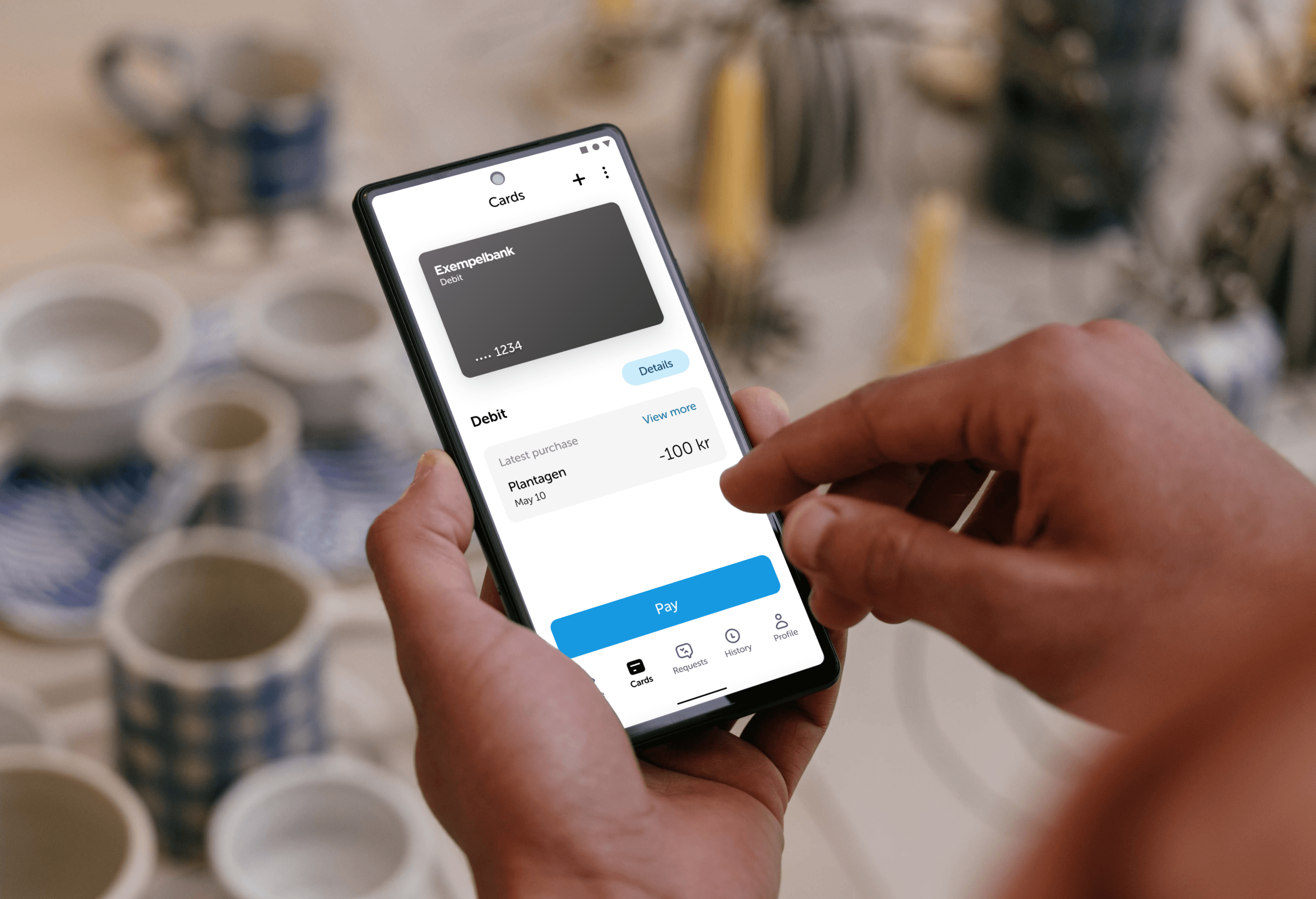
For customers
Approached to remove points of friction when paying invoices, by focusing on information understandability & improving accuracy & speed to pay invoices to support customers feeling of financial control & safety.
For SEB Kort
Reduce number of calls to customer support, consolidating mobile apps as the key supporting touch point for customers utilising their credit cards.
Approach
Customer journey centered
Created customer journey map to holistically collect customer & business points of views. Informed by user feedback, customer service insights & framing credit cards as products. Served as a collective understanding for multidisciplinary discussions with designers, engineers & product managers.
Co-creation
I facilitated co-creation workshops with SEB Kort’s lead designer and internal UX/UI designers to explore potential improvements.
Used the workshops to generate broad ideas and define key in-app user flows before further refinment.
Cross competence collaboration
Early collaboration with with SEB Kort’s in-house head of design & chief product owner allowed us to pitch & advocate for a wider product vision that pushed past short term first release fixes and support buy in from a wide range of stakeholders.
Before the redesign
Viewing invoices in SEB Kort's app was flagged with challenges for users, resulting in large numbers of calls to customer service each month.
This included an easy to miss entrance to view invoices considering it's importance.
Nor did the entrance button sign post when a new invoice was available to view/pay.
Opening invoices, enters a web view in the app, lacking accessibility support such as scaled type, and featured two competing back navigation buttons.
The invoice was displayed in ways making it difficult to find relevant information quickly.

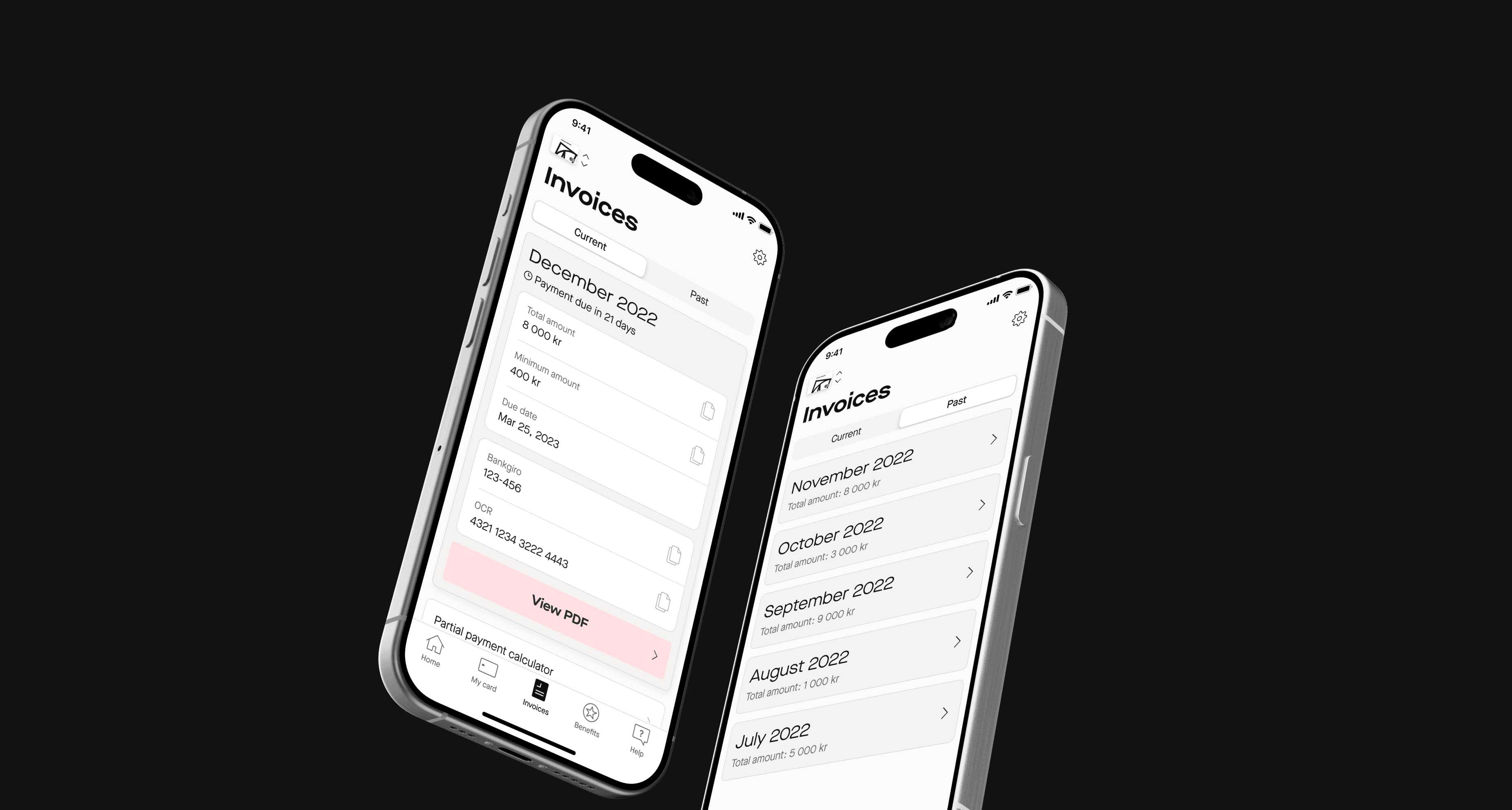
Redesign
Introduced a new 'Invoice' tab, with clear sign posting.
Users get immediate access to understanding when an invoice is due and how much one needs to pay.
Segmented controls highlight which invoices are relevant for users right now, whilst still providing access to the full history.
